Semantic Text Editor
- Alexis Hale

- Dec 9, 2018
- 6 min read
For our final project, my Human-Computer Interaction class was tasked with creating a solution for an unsolved problem in user design interfaces. My group consisted of myself, Eddie, Leo, and Jacob. We would have to draw on our own experiences to find an interface we were unsatisfied with. We ended up deciding to improve modern text editors - more specifically, how text is stylized and challenge the reasoning behind text stylization.
How often do you use the style section in Microsoft Office (outlined in green)? In all my years, I have never used the styles in this section in a document. If you asked me to draw Word’s user interface from memory, I would only draw the font and paragraph tools (outlined in blue). I exclusively use just these tools when I create documents. Now, why is that? And why is it bad?

What's Wrong with it?Modern text editors have lost the structure and functional role of a document’s semantic context. Simply put, standard text editors like Microsoft Office Word rely on style settings - making text bold or italicized, altering font and size, adjusting alignment and spacing. For example, if a user is titling a poem, they might think “here’s some text and I’m going to use Arial font and put it in quotes” in lieu of “this is the title of a poem so it should be in quotes and in a larger font than the body of the poem”. The second thought process focuses on the text’s functional role and semantics. In order to solve this problem, we created a new interface for text editors that focus on styling with semantic content.
Considering that this is not the standard method for text editing, we have to create and enforce a new mental model in the user’s mind. This is particularly challenging because we have to compete with the existing mental model of text editing. When making our design choices, we made sure that we reinforced the semantic mental model. Firstly, we sought to make our design easily accessible; our newly design set of tools is based on the left panel that appears whenever the user highlights text, making it readily available to the user. Second, throughout our iterations, we improved the appearance and organization of our user interface so it wouldn’t slow hinder users when stylizing their document.

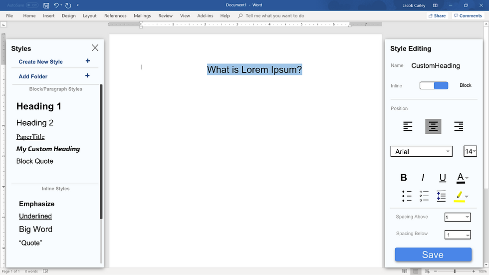
To limit the user’s access to the traditional tools, we designed it so they are only accessible when the user creates a new style. By doing this, we enforce the usage of the structured semantic method (i.e. this is a title, quote, heading, subheading).
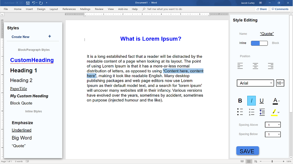
Our semantic model text editor doesn’t just introduce an enhanced mental model for structuring and seizing documents, but also comes with many other benefits. This design is highly personalizable; users can create all their own styles to suit their needs. For example, users who are submitting a paper to scientific journals must follow a set structure and style; main section headings should be written in all caps, centered at the beginning of a section and double-spaced from the lines before and after it. This user could set up this main section heading once and be able to apply it easily to all future documents. This allows the user to remain consistent through one document by using the same kinds of headings, subheadings, etc. When the user changes the appearance of a style in the style’s settings, it replaces all instances of that style within the document. This helps the user makes changes efficiently and consistently. Additionally, a user might want to group multiple styles together into a folder. A user could work for a company like Netflix and want to create a set of styles that follow Netflix’s branding guide, ensuring that the same fonts, sizes, and colors are used on documents made for Netflix.

Users can also search for particular styles, facilitating navigation in large documents. If a user creates a style for code that they inserted throughout their text, they can search for their style name “code” and it will find all instances of text that use that style.
Our design also implements two kinds of semantic text styles: block styles and inline styles. Block styles are for styling larger chunks of text with structural meaning like headings, titles, and paragraph styles. Inline styles are for applying to smaller bits of text in case the user just wants to style a few words or even a letter.
The Process
Our 1st Iteration
When we initially started our project, we were using a suggestion-based model that would make style suggestions as the user typed. This created a variety of problems for us. We didn’t know when our program should make these suggestions; What indicates that the user is making a title? How would we know the phrase was done? We weren’t entirely sure how to answer these questions.
We had two forms of this initial iteration, the hand-drawn wireframes and then the interactive digitized version of that. When user testing this iteration, our user, Brian, didn’t recognize our tools as a menu. He commented that the menu took up too much of the screen, that there should be more style features and suggestions for font styles. This particular iteration was rather unsuccessful but was fundamental for pivoting to our future iterations.


Our 2nd Iteration
We regrouped and evaluated if we were headed in the right direction. We realized that we didn’t have to work on auto-suggesting the different structural parts of a document; the user had this information in their head. We just had to make it easy to implement. We focused on the main tasks the user needed to complete and created a new interface.


We wound up with an interface with two panes. The left pane had the default styles and had the option of creating custom styles. The existing styles could be edited by right clicking on them and selecting “edit” on the right click menu. The right pane would be for the detailed settings that users traditionally see. This pane is only accessible when the user wants to create or modify styles. We also planned a right click menu that would also have all of the styles listed. This right-click menu was designed to be more time efficient so users didn’t have to cross the screen to access the left panel. We specifically had more experienced users in mind here because the right-click menu would not have a preview of the styles’ appearance like the left pane does.
Once we finished creating the interactive digital wireframes, we were ready for our second user test. A classmate, Michael, volunteered to test our prototype out. We gave Michael a few tasks to try out: creating a new style, editing a style, and modifying an existing style. He commented that he liked the simple menus. After observing Michael, we learned that there is a learning curve; users initially had difficulties understanding what the interface does. We also wanted to improve the overall aesthetic appearance of the prototype.
Our 3rd (and Final) Iteration
For our third iteration, we made minor aesthetic changes to the whole prototype. This included adding lines to separate different elements and reformatting our elements so they were more aligned. We also added more functionality including the search bar and the style folders that I mentioned previously. We thought that the interface could become encumbered if a user had more than 15 styles, so the folder would add another level of organization and allow users to group styles into themes. The search bar would allow users to easily locate specific structures of text in large documents like quotes or lines of code.


Brian, our first user tester also tested our final iteration. He commented that he liked the right-click menu and that adding a new style seemed intuitive. The conventional icons we used in the right pane made it easy to learn. He was able to use the styles with little hesitation. We were happy to see that all our hard work paid off and that we had made significant improvements since our initial prototype.
Below is a demonstration of our final prototype in action:
If you would like to explore our final prototype's interactive wireframes click here to access our Invision project.
Concluding Remarks
I was so excited when we had created the first iteration of our prototype, but it was so different than our final iteration. This taught me not to fall in love with the first version of an idea. We improved both functions and appearance through our multiple iterations. Sometimes, I would find myself focusing on details and function that weren’t necessary or related to our central goal. It’s easy to lose focus on a project like this and head in the wrong direction. I’d have to reorient myself by writing our goal on a whiteboard and writing a game plan for what needed to get done.
To create an interface for a semantics-based editor, we focused on working with specified structures like titles, headings, subheadings, and quotes. It’s essential to focus on the text’s meaning and why the text is styled and organized differently. We enforced this new mental model by making it easy to access; it pops up whenever text it highlighted. We wanted it to be the user’s “go-to” tool. After user testing and creating multiple iterations of our prototype, I’m convinced of our final product’s feasibility and utility.


Comments